Functional Web Design: Why Only Rookies Focus on Pretty Websites
Functional web design. Why a pretty website doesn’t sell. How to create a website that really works. Profitable web design
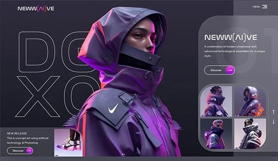
Yes, you read that title right. Only rookies design pretty websites (true professionals create usable websites). By pretty, I mean the designs you see on Instagram, Dribbble, Behance, and Pinterest.
Let me clarify something important.
Design Is Not Art: It's Problem-Solving
Design solves a problem. It serves a purpose. It is objective. Therefore, it is not supposed to look pretty. It simply has to work.
If you are building a website to impress your art teacher or win a design award, then go ahead. Design the prettiest website you can. But if you want to create a website that generates traffic, sales, or subscriptions, you need a functional website that serves that specific purpose.
Why a pretty website doesn’t sell?
Look at the best websites in the world. They serve a purpose. A course website needs to sell courses. A blog website requires many readers and then keeping them reading for a long period of time. An e-commerce site sells many products, and a social media site wants you to stay there all day.
Do sites like Google, Facebook, YouTube, and Amazon look pretty to you?
Let’s look at some of the best websites in different industries that got high numbers of visits in August 2025.
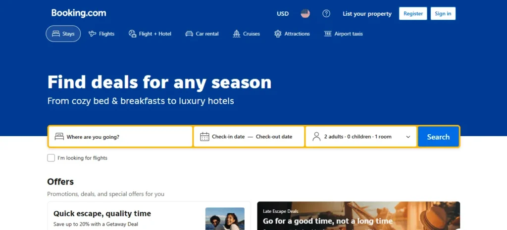
Here is Booking.com. 513 million visits.
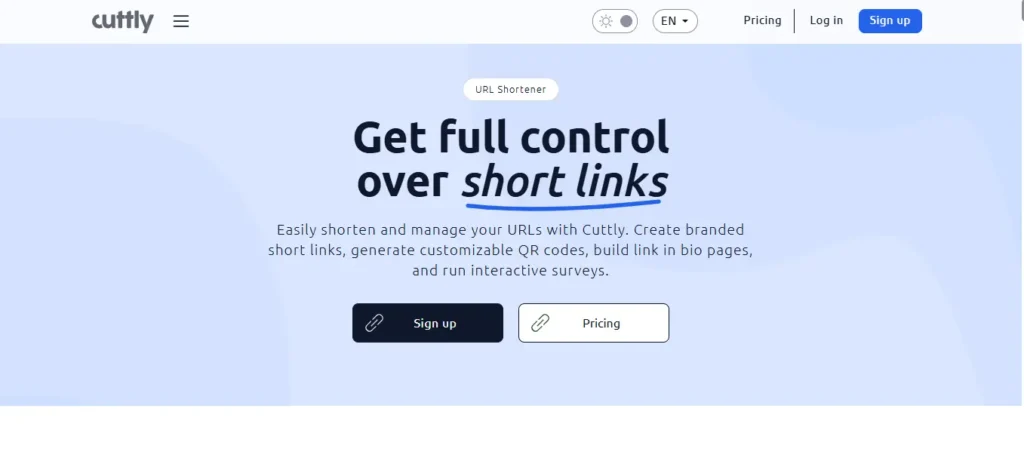
Cutt.ly 72 million visits.
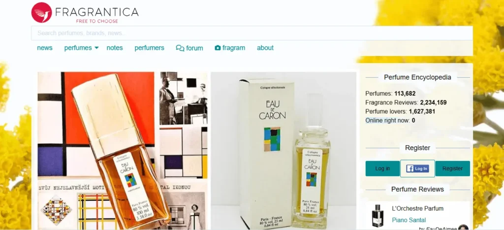
Fragrantica, a beauty and cosmetics website, 44 million visits in one month.
Do these websites look the most beautiful to you? I could go on. Just go to Semrush and check out the top websites in any category. You won’t find a single one that prioritizes beauty over function.
You might think these big companies can hire the best designers and developers. So, why is their design so simple and sometimes boring? The answer is in the question itself. Yes, they hire the best designers and developers, and they cost a lot of money. So, naturally, the priority is to build a profitable website, not a pretty website. Designers are not worried about creating pretty websites, because their job, their promotions, and their career revolve around metrics, not how the site looks.
Often, the designs you see on platforms like Dribbble were made in Figma or Canva as digital art projects, not as real, functional website prototypes. Now let me explain why, in theory, a pretty website is not profitable. I mean, that would be ideal.
The "Pretty" Trap: Why It Fails in the Real World
In reality, you already know the answer. You just don’t realize it when you are the one building the website. As a user, why do you visit a website? To learn something, order a product, watch videos, or browse social media. There is always a purpose. When you visit YouTube, you want to see video recommendations that suit your style. Then you want easy access to all the buttons and options.
You just want things to be simple, straightforward, and easy to use. You want to do your thing and leave. After all, you have many things to do, and the last thing you want is a website that is complicated and wastes your time. When you search for something, you want results quickly and in front of you in a simple design. Most of the time, you don’t even look at the screen. You just ask Google, and it gives you the answer.
AI products already exist where you tell the AI to order something or book a table for you. You don’t even have to look at your screen. Do you see a pattern yet? People want things simple and user-friendly.
Companies know this because they do their research. That’s why they want to keep things very simple and user-friendly. In the attention economy, the user is king. That means websites that provide the best user experience win users and their valuable time and money. You don’t care how pretty Amazon looks. You just want to go there, find what you are looking for, read reviews, see product images, and then place the order. You want to spend the least amount of time possible.
Simple or pretty. Every website you see is built with HTML, CSS, and JavaScript. Now, this code runs in your browser. Good designers design websites with this in mind. They know the limitations of browsers. Pretty websites take longer to load due to all the images, videos, and ornamentation they have. Then they don’t work on small screens because of how things are positioned. It can become chaos for the browser and for the users.
Also, they are a little harder to program. That’s not a huge deal. But there is no benefit in writing a lot of CSS if the browsers and users are not happy. In short, pretty websites take longer to load and do not respond well to screen sizes. That is a bad user experience, and that is the last thing you want.
So, the question is, what should you do? Build a user-friendly website.
How to Build a Website That Actually Works: The 5 Pillars
I am going to give you some very practical tips that you can use to build a user-friendly website. A website rests on these five pillars: layout, typography, colors, images, and content. If you get these five things right, you are set for success. So let’s go over them one by one.
1. Layout
The layout of a website is the first thing the user sees. Layout means the general structure of the website. In seconds, a user can feel if a layout is good or bad. Remember, good does not mean pretty. It means easy to use. Layout is the first thing you should think about when building a website, because at this point you will think about how this website will adapt to different screen sizes.
Layout (Rows and Columns)
To do that, divide your content into rows and columns, and then arrange them on the screen. If you work with tools like WordPress or Elementor Pro, these principles of columns and rows are the foundation of how their visual builders work, ensuring your design is functional before being ‘pretty’. Here is an example.
Desktop Layout
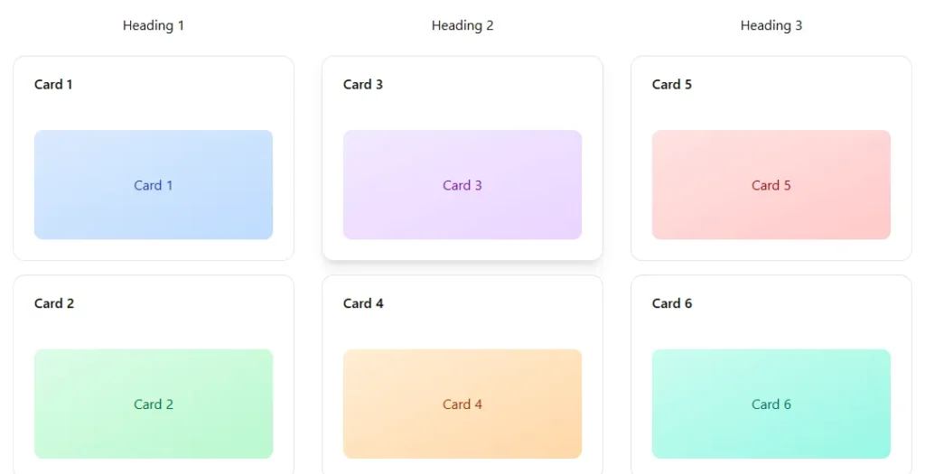
We have these six cards on this website, but you can see that we also have three headings, and each heading is connected to two cards. Now, how can we organize them so they respond to different screen sizes? That is, we want these cards to correspond to their heading, but we need to adjust their position on a tablet and then also on a smartphone.
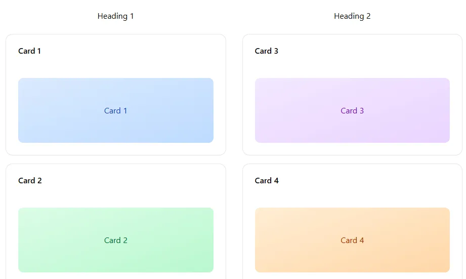
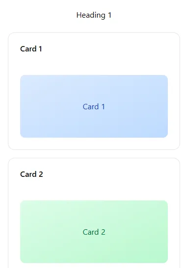
The easy solution is to move the last column to the next row on tablets, and then move the second column to the next row on smartphones. Thus, on the laptop, we have one row and three columns, but on the smartphone, we have three rows and one column.
Tablet Layout
Mobile Layout
We have a CSS property called Flexbox that will take care of these things for you, but you just need to start thinking in terms of rows and columns.
Let me show you one more example.

Here we have two columns. Column one has a heading and some information, and column two has an image. This is a fairly common and successful layout. On a larger screen, we can fit both columns in a single row, but on smartphones, it makes sense to move one of the columns to the next row.

Size and Spacing (The Rule of Eight)
A very important part of the layout is size and spacing. Novice designers and developers struggle a lot with that. Let me introduce you to the number eight. This is the number that will help you with all your sizing and spacing problems. Here is how it works. Any size or space you use on your website should be divisible by eight. So, numbers like 8, 16, 64, 120, etc.
Do you need a width for a button? Try 16 pixels. Doesn’t look good? Try 24. Try 32. Try a number that is divisible by eight. How much padding for a section? Try 40 pixels. Doesn’t look good? Try 64. Try 80. How much spacing between two columns? Try 16 pixels. Try 40. Try 64. But don’t try 30, as it is not divisible by eight.
Consistency (Repetition as a Pillar)
This brings me to consistency. Your layout has to be consistent. If you gave 32 pixels of space between two columns, keep the same space throughout your website. Don’t put 24 or 28 pixels in other columns. A good design repeats itself.
You will find these basic design principles on all websites. Here is a simple Google search.
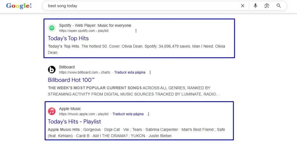
Pay attention to how the design repeats. Did you notice the same spacing in the design? The same with each result. Icon, title, and URL. Then a clickable link as a heading, and then a small paragraph. The beauty lies in making things simple and easy to use. Users can quickly skim many links and decide which one to click.
While building a website’s layout, think about how your users will navigate through it. Humans are pattern recognition machines. We expect things to repeat. Just as we repeat the layout, we also repeat the same fonts, colors, and overall vibe. Consistency is the key here.
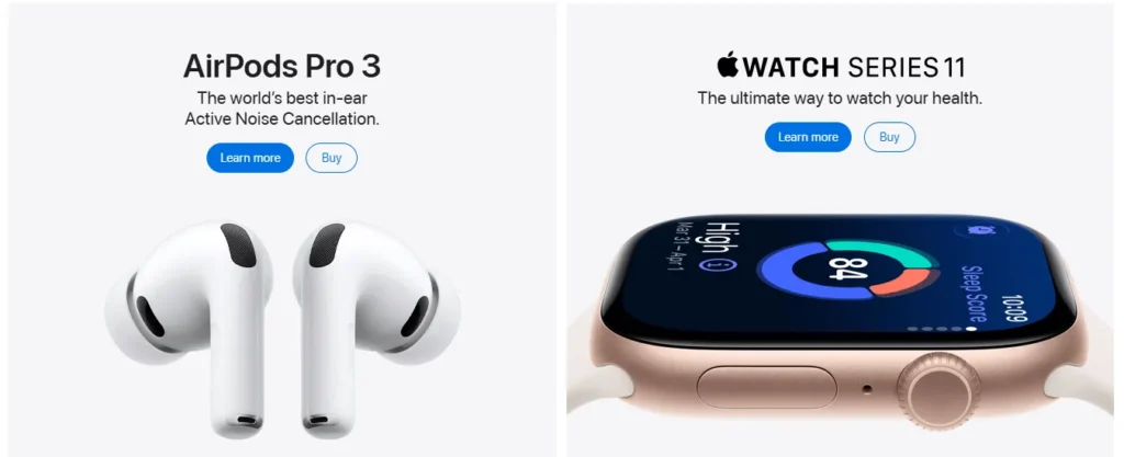
Do this for yourself and take your time, visit the Apple homepage. Apple cares a lot about good design. Notice how they only use three colors throughout the entire website. Black, white, and blue. And that is a real example of less is more. White background, black text, and blue buttons. They could have added red, orange, and all kinds of colors, but they didn’t. It’s about repeating the same colors over and over.
Let me show you another design pattern. Look at this section of the same Apple website.
We have two columns. Each column has a title, a subtitle, two buttons, and an image. Imagine you build this website from scratch. You build section one and then you simply copy and paste it. Then you only have to replace the content inside. This is called component-based design and it is quite common in the industry. Work smarter, not harder.
That being said, let’s move on to pillar number two for building a user-friendly website. Typography. That’s a fancy way of saying fonts.
2. Typography
Let’s stay with Apple for now.
Look at how it has different font sizes. Now, how will you know what size to use and where? This is called a typographic scale, and we have many very useful websites that will help you generate typographic scales. Just enter the body text font. It is the default font size for your paragraphs and then it will give you all the other sizes according to your need. I use escalafont.com and typescale.com.
Once you have the sizes of your headings and paragraphs, make all the fonts the same size as the body font. Then ask yourself what the most important part of the website is. I guess the headings. So, give the headings their size and then move on to the next important things. Keep many things with the body font size and make the less relevant parts smaller and the more important parts larger. It’s that simple. It’s what many call visual hierarchy.
Try to use a clean and easy-to-read font. If possible, use only one font throughout the website. The more fonts you use, the more chances of messing it up. Here are my five preferred fonts for websites, but feel free to experiment, and that is also true for our next pillar.
Inter
– Why: Specifically designed for digital interfaces.
– Style: Modern sans serif, clean and super legible at small sizes.
– Ideal Uses: Body text, dashboards, blogs, apps.
– Tip: Combine Inter in the body with a more striking font for headings if you want contrast.
Roboto
– Why: Google classic. Balances friendly curves and geometry.
– Style: Neutral sans serif, doesn’t tire the eye on long screens.
– Ideal Uses: Corporate sites, e-commerce, mobile applications.
– Tip: Its variant Roboto Condensed is perfect for menus and subtitles.
Open Sans
– Why: Very high legibility, even at low resolutions.
– Style: Humanist sans serif (a little warmer than Roboto).
– Ideal Uses: Blogs, landing pages, sites with a lot of text.
– Tip: It works very well when you are looking for a “friendly” or accessible feel.
Lato
– Why: Popular for years because it combines professionalism and closeness.
– Style: Sans serif with a rounded touch.
– Ideal Uses: Startups, creative portfolios, service websites.
– Tip: Use it in medium or large headings; its “Bold” weight is elegant.
Playfair Display (for titles)
– Why: Modern serif that provides personality and contrast.
– Style: Ideal for headlines, quotes, or hero sections.
– Ideal Uses: Blogs, digital magazines, luxury landing pages.
– Tip: Combine Playfair Display in headings with Inter or Roboto in paragraphs.
3. Colors
As with fonts, the fewer colors you use, the better. Stick to black and white for most things and add an accent color to give it some personality. If you have images on the website, those images will add some character anyway.
Here is how you can create a color palette for your website. Visit this website coolors.co and choose a palette you like. Now decide which will be the primary color. Your primary is your default color. Most of the website will have that color. Then choose your secondary or background color. If you chose a dark color like black as your primary color, choose a light color like white as your secondary color. Then select one color as your accent color. You will use that color five or ten percent of the time. The accent color will be used to style your buttons, icons, and other graphics on the website. Have another shade of that accent color to use in the “hover” state (when the cursor passes over it). For example, if you chose orange as your accent color, use a dark orange as your accent two. This way, if the user hovers over the button, it should change color. This makes the website more lively and easy to use.
4. Images
And nothing makes a website more lively than icons, images, and illustrations. It is the fourth pillar in building a user-friendly website. Icons can make things easier to understand. Use these websites to get royalty-free icons and images.
There are many others, just search on Google.
Use sharp and clean images, but you must optimize them before putting them on your website. This website will help you with that tinypng.com. Every image on your page will slow down your website, but people prefer to simply skim the page looking at the images and headings. So keep some powerful images that complement your content. Don’t just download and upload random images to fill space. You can’t be lazy here. Use images that speak to the user.
5. Content. The Most Important Pillar
And that brings me to the final and most important pillar of the website. Content. Content is everything. People will visit and stay on your site, even if you ignore all the design principles. Just look at Craigslist.
It’s slow and ugly, but it gets around 10 million visits every day. Yes, 10 million in a single day. Why? Because people are there for a purpose, and the ads fulfill that purpose.
So if you are building a course website, have the best course on the market. If you are building a blog, write good articles. If you are building an e-commerce site, be transparent. Show users the images, reviews, and all the information they need to make an informed purchase.
In general, if you are building a website, first ask yourself, why do you need a website? Ask your users if they like a website. Ask them what they want to see there, and then simply deliver it. Of course, try to make a website that looks good too, but your content will drive traffic, sales, and anything you could want from a website.
Conclusion
One last piece of advice. Building a website is a process of trial and error. Your website will evolve over time. Keep collecting feedback from users and other important data, and make changes to your website. So if you are building a completely new website, just make it good enough and publish it. Your version 1 will never be perfect, and neither will version 10, but it will be better than what you had before.
These things may sound obvious to you, but beginners generally try to build a pretty website. They fall into the Dribbble and Instagram trap and lose focus. They think building is like creating some kind of art. It is not at all. Maybe if you are an artist, you can build something extraordinary, but for normal businesses, it just doesn’t work.
So here is the key takeaway. Only rookies build pretty websites. Professionals build user-friendly websites with a main focus on content and users.
Do you want a site that impresses your colleagues or a site that makes you money? That is the real decision. Start building for your users, not for your Instagram feed.
Need a Site That Actually Sells?
Functional Web Design: Why Only Rookies Focus on Pretty Websites
Yes, you read that title right. Only rookies design pretty websites (true professionals create usable websites). By pretty, I mean the designs you see on Instagram, Dribbble, Behance, and Pinterest.
Let me clarify something important.
Design Is Not Art: It's Problem-Solving
Design solves a problem. It serves a purpose. It is objective. Therefore, it is not supposed to look pretty. It simply has to work.
If you are building a website to impress your art teacher or win a design award, then go ahead. Design the prettiest website you can. But if you want to create a website that generates traffic, sales, or subscriptions, you need a functional website that serves that specific purpose.
Why Do the World's Most Successful Websites Look "Boring"?
Look at the best websites in the world. They serve a purpose. A course website needs to sell courses. A blog website requires many readers and then keeping them reading for a long period of time. An e-commerce site sells many products, and a social media site wants you to stay there all day.
Do sites like Google, Facebook, YouTube, and Amazon look pretty to you?
Let’s look at some of the best websites in different industries that got high numbers of visits in August 2025.
Here is Booking.com. 513 million visits.
Cutt.ly 72 million visits.
Fragrantica, a beauty and cosmetics website, 44 million visits in one month.
Do these websites look the most beautiful to you? I could go on. Just go to Semrush and check out the top websites in any category. You won’t find a single one that prioritizes beauty over function.
You might think these big companies can hire the best designers and developers. So, why is their design so simple and sometimes boring? The answer is in the question itself. Yes, they hire the best designers and developers, and they cost a lot of money. So, naturally, the priority is to build a profitable website, not a pretty website. Designers are not worried about creating pretty websites, because their job, their promotions, and their career revolve around metrics, not how the site looks.
Often, the designs you see on platforms like Dribbble were made in Figma or Canva as digital art projects, not as real, functional website prototypes. Now let me explain why, in theory, a pretty website is not profitable. I mean, that would be ideal.
The "Pretty" Trap: Why It Fails in the Real World
In reality, you already know the answer. You just don’t realize it when you are the one building the website. As a user, why do you visit a website? To learn something, order a product, watch videos, or browse social media. There is always a purpose. When you visit YouTube, you want to see video recommendations that suit your style. Then you want easy access to all the buttons and options.
You just want things to be simple, straightforward, and easy to use. You want to do your thing and leave. After all, you have many things to do, and the last thing you want is a website that is complicated and wastes your time. When you search for something, you want results quickly and in front of you in a simple design. Most of the time, you don’t even look at the screen. You just ask Google, and it gives you the answer.
AI products already exist where you tell the AI to order something or book a table for you. You don’t even have to look at your screen. Do you see a pattern yet? People want things simple and user-friendly.
Companies know this because they do their research. That’s why they want to keep things very simple and user-friendly. In the attention economy, the user is king. That means websites that provide the best user experience win users and their valuable time and money. You don’t care how pretty Amazon looks. You just want to go there, find what you are looking for, read reviews, see product images, and then place the order. You want to spend the least amount of time possible.
Simple or pretty. Every website you see is built with HTML, CSS, and JavaScript. Now, this code runs in your browser. Good designers design websites with this in mind. They know the limitations of browsers. Pretty websites take longer to load due to all the images, videos, and ornamentation they have. Then they don’t work on small screens because of how things are positioned. It can become chaos for the browser and for the users.
Also, they are a little harder to program. That’s not a huge deal. But there is no benefit in writing a lot of CSS if the browsers and users are not happy. In short, pretty websites take longer to load and do not respond well to screen sizes. That is a bad user experience, and that is the last thing you want.
So, the question is, what should you do? Build a user-friendly website.
How to Build a Website That Actually Works: The 5 Pillars
I am going to give you some very practical tips that you can use to build a user-friendly website. A website rests on these five pillars: layout, typography, colors, images, and content. If you get these five things right, you are set for success. So let’s go over them one by one.
1. Layout
The layout of a website is the first thing the user sees. Layout means the general structure of the website. In seconds, a user can feel if a layout is good or bad. Remember, good does not mean pretty. It means easy to use. Layout is the first thing you should think about when building a website, because at this point you will think about how this website will adapt to different screen sizes.
Layout (Rows and Columns)
To do that, divide your content into rows and columns, and then arrange them on the screen. If you work with tools like WordPress or Elementor Pro, these principles of columns and rows are the foundation of how their visual builders work, ensuring your design is functional before being ‘pretty’. Here is an example.
Desktop Layout
We have these six cards on this website, but you can see that we also have three headings, and each heading is connected to two cards. Now, how can we organize them so they respond to different screen sizes? That is, we want these cards to correspond to their heading, but we need to adjust their position on a tablet and then also on a smartphone. The easy solution is to move the last column to the next row on tablets, and then move the second column to the next row on smartphones. Thus, on the laptop, we have one row and three columns, but on the smartphone, we have three rows and one column.
Tablet Layout
Mobile Layout
We have a CSS property called Flexbox that will take care of these things for you, but you just need to start thinking in terms of rows and columns.
Let me show you one more example.
Here we have two columns. Column one has a heading and some information, and column two has an image. This is a fairly common and successful layout. On a larger screen, we can fit both columns in a single row, but on smartphones, it makes sense to move one of the columns to the next row.
Size and Spacing (The Rule of Eight)
A very important part of the layout is size and spacing. Novice designers and developers struggle a lot with that. Let me introduce you to the number eight. This is the number that will help you with all your sizing and spacing problems. Here is how it works. Any size or space you use on your website should be divisible by eight. So, numbers like 8, 16, 64, 120, etc.
Do you need a width for a button? Try 16 pixels. Doesn’t look good? Try 24. Try 32. Try a number that is divisible by eight. How much padding for a section? Try 40 pixels. Doesn’t look good? Try 64. Try 80. How much spacing between two columns? Try 16 pixels. Try 40. Try 64. But don’t try 30, as it is not divisible by eight.
Consistency (Repetition as a Pillar)
This brings me to consistency. Your layout has to be consistent. If you gave 32 pixels of space between two columns, keep the same space throughout your website. Don’t put 24 or 28 pixels in other columns. A good design repeats itself.
You will find these basic design principles on all websites. Here is a simple Google search.
Pay attention to how the design repeats. Did you notice the same spacing in the design? The same with each result. Icon, title, and URL. Then a clickable link as a heading, and then a small paragraph. The beauty lies in making things simple and easy to use. Users can quickly skim many links and decide which one to click.
While building a website’s layout, think about how your users will navigate through it. Humans are pattern recognition machines. We expect things to repeat. Just as we repeat the layout, we also repeat the same fonts, colors, and overall vibe. Consistency is the key here.
Do this for yourself and take your time, visit the Apple homepage. Apple cares a lot about good design. Notice how they only use three colors throughout the entire website. Black, white, and blue. And that is a real example of less is more. White background, black text, and blue buttons. They could have added red, orange, and all kinds of colors, but they didn’t. It’s about repeating the same colors over and over.
Let me show you another design pattern. Look at this section of the same Apple website.
We have two columns. Each column has a title, a subtitle, two buttons, and an image. Imagine you build this website from scratch. You build section one and then you simply copy and paste it. Then you only have to replace the content inside. This is called component-based design and it is quite common in the industry. Work smarter, not harder.
That being said, let’s move on to pillar number two for building a user-friendly website. Typography. That’s a fancy way of saying fonts.
2. Typography
Let’s stay with Apple for now.
Look at how it has different font sizes. Now, how will you know what size to use and where? This is called a typographic scale, and we have many very useful websites that will help you generate typographic scales. Just enter the body text font. It is the default font size for your paragraphs and then it will give you all the other sizes according to your need. I use escalafont.com and typescale.com.
Once you have the sizes of your headings and paragraphs, make all the fonts the same size as the body font. Then ask yourself what the most important part of the website is. I guess the headings. So, give the headings their size and then move on to the next important things. Keep many things with the body font size and make the less relevant parts smaller and the more important parts larger. It’s that simple. It’s what many call visual hierarchy.
Try to use a clean and easy-to-read font. If possible, use only one font throughout the website. The more fonts you use, the more chances of messing it up. Here are my five preferred fonts for websites, but feel free to experiment, and that is also true for our next pillar.
Inter
– Why: Specifically designed for digital interfaces.
– Style: Modern sans serif, clean and super legible at small sizes.
– Ideal Uses: Body text, dashboards, blogs, apps.
– Tip: Combine Inter in the body with a more striking font for headings if you want contrast.
Roboto
– Why: Google classic. Balances friendly curves and geometry.
– Style: Neutral sans serif, doesn’t tire the eye on long screens.
– Ideal Uses: Corporate sites, e-commerce, mobile applications.
– Tip: Its variant Roboto Condensed is perfect for menus and subtitles.
Open Sans
– Why: Very high legibility, even at low resolutions.
– Style: Humanist sans serif (a little warmer than Roboto).
– Ideal Uses: Blogs, landing pages, sites with a lot of text.
– Tip: It works very well when you are looking for a “friendly” or accessible feel.
Lato
– Why: Popular for years because it combines professionalism and closeness.
– Style: Sans serif with a rounded touch.
– Ideal Uses: Startups, creative portfolios, service websites.
– Tip: Use it in medium or large headings; its “Bold” weight is elegant.
Playfair Display (for titles)
– Why: Modern serif that provides personality and contrast.
– Style: Ideal for headlines, quotes, or hero sections.
– Ideal Uses: Blogs, digital magazines, luxury landing pages.
– Tip: Combine Playfair Display in headings with Inter or Roboto in paragraphs.
3. Colors
As with fonts, the fewer colors you use, the better. Stick to black and white for most things and add an accent color to give it some personality. If you have images on the website, those images will add some character anyway.
Here is how you can create a color palette for your website. Visit this website coolors.co and choose a palette you like. Now decide which will be the primary color. Your primary is your default color. Most of the website will have that color. Then choose your secondary or background color. If you chose a dark color like black as your primary color, choose a light color like white as your secondary color. Then select one color as your accent color. You will use that color five or ten percent of the time. The accent color will be used to style your buttons, icons, and other graphics on the website. Have another shade of that accent color to use in the “hover” state (when the cursor passes over it). For example, if you chose orange as your accent color, use a dark orange as your accent two. This way, if the user hovers over the button, it should change color. This makes the website more lively and easy to use.
4. Images
And nothing makes a website more lively than icons, images, and illustrations. It is the fourth pillar in building a user-friendly website. Icons can make things easier to understand. Use these websites to get royalty-free icons and images.
There are many others, just search on Google.
Use sharp and clean images, but you must optimize them before putting them on your website. This website will help you with that tinypng.com. Every image on your page will slow down your website, but people prefer to simply skim the page looking at the images and headings. So keep some powerful images that complement your content. Don’t just download and upload random images to fill space. You can’t be lazy here. Use images that speak to the user.
5. Content. The Most Important Pillar
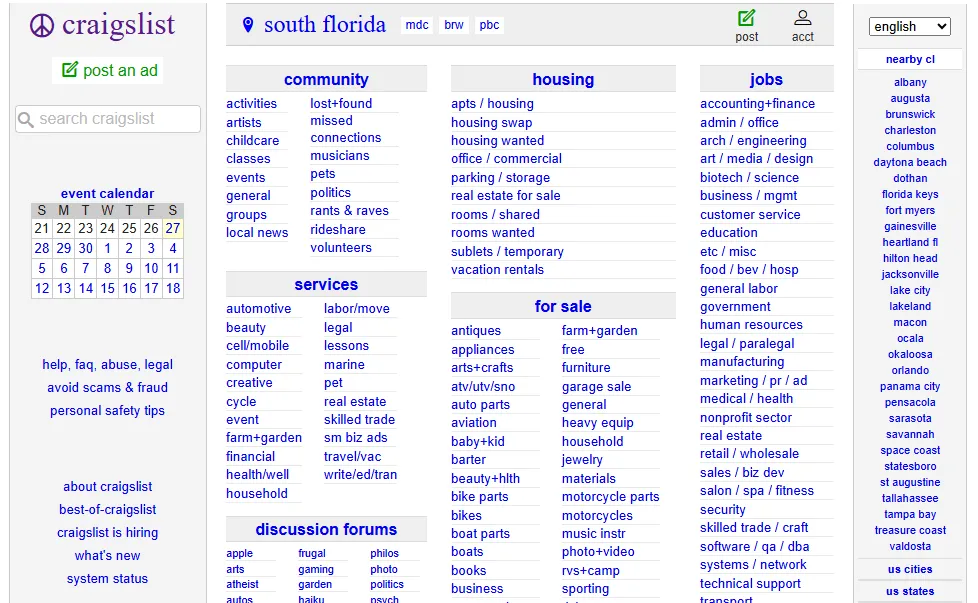
And that brings me to the final and most important pillar of the website. Content. Content is everything. People will visit and stay on your site, even if you ignore all the design principles. Just look at Craigslist.
It’s slow and ugly, but it gets around 10 million visits every day. Yes, 10 million in a single day. Why? Because people are there for a purpose, and the ads fulfill that purpose.
So if you are building a course website, have the best course on the market. If you are building a blog, write good articles. If you are building an e-commerce site, be transparent. Show users the images, reviews, and all the information they need to make an informed purchase.
In general, if you are building a website, first ask yourself, why do you need a website? Ask your users if they like a website. Ask them what they want to see there, and then simply deliver it. Of course, try to make a website that looks good too, but your content will drive traffic, sales, and anything you could want from a website.
Conclusion
One last piece of advice. Building a website is a process of trial and error. Your website will evolve over time. Keep collecting feedback from users and other important data, and make changes to your website. So if you are building a completely new website, just make it good enough and publish it. Your version 1 will never be perfect, and neither will version 10, but it will be better than what you had before.
These things may sound obvious to you, but beginners generally try to build a pretty website. They fall into the Dribbble and Instagram trap and lose focus. They think building is like creating some kind of art. It is not at all. Maybe if you are an artist, you can build something extraordinary, but for normal businesses, it just doesn’t work.
So here is the key takeaway. Only rookies build pretty websites. Professionals build user-friendly websites with a main focus on content and users.
Do you want a site that impresses your colleagues or a site that makes you money? That is the real decision. Start building for your users, not for your Instagram feed.